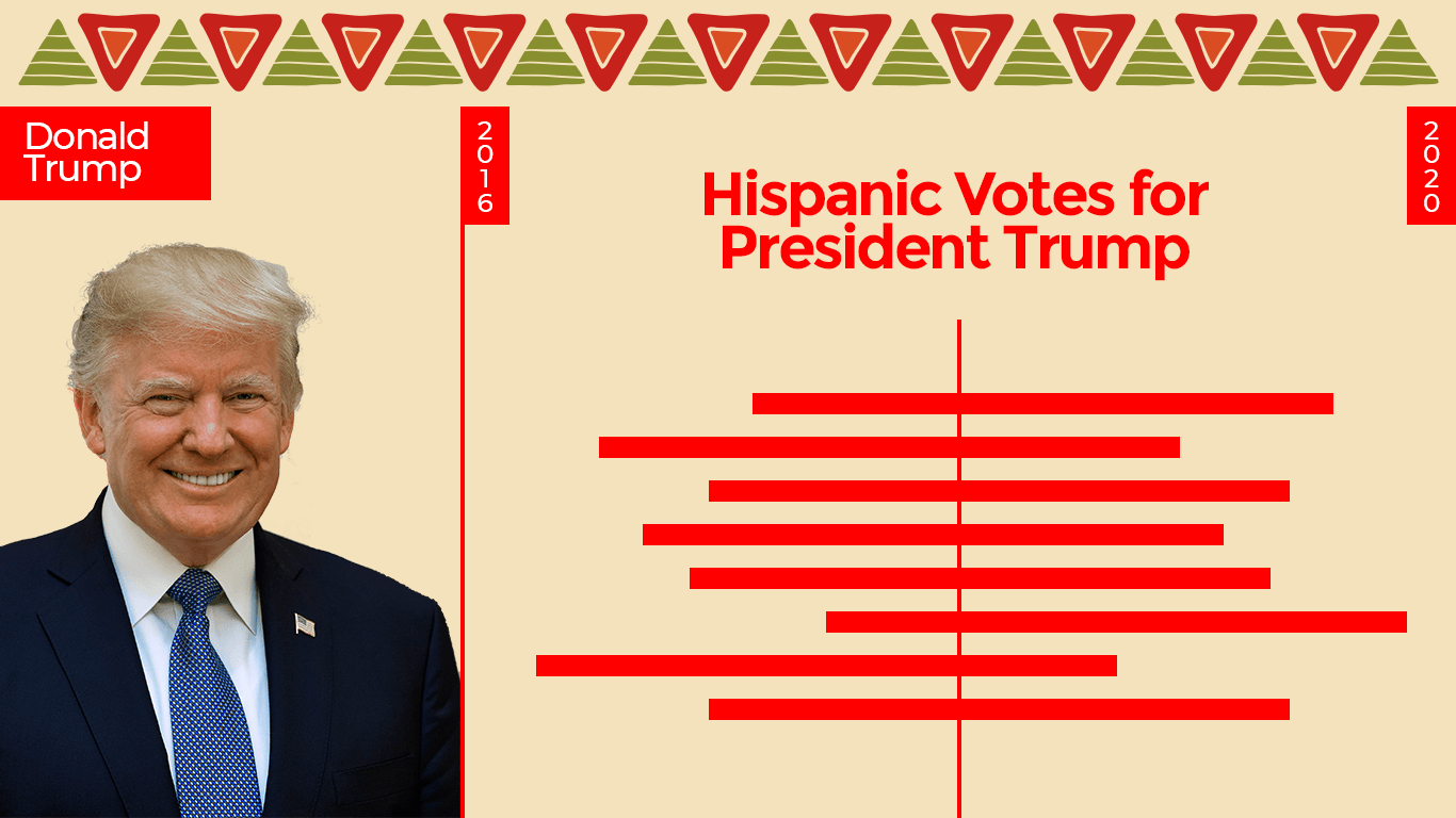
The 1st approach is taking counties which have the highest density of Latino population like Webb, Starr, Maverick etc in that county, ideally about 90% of these counties identify as Hispanic/Latino based on the 2018 ACS. The 2nd approach was to check and see in counties where the number of Latino (Hispanic) voters are great than a million or atleast close to million. Using these 2 types of counties as basis we compare President Trump's primary votes numbers to figure out his Latino Support.
We start off with the analysis for the counties where the Latino/Hispanic population is greater than 90% in the county. All of these counties happen to be in Texas close to the US/Mexican border. Click on the % Latino Population button to figure out what percentage of the population is Latino.
The graph clearly shows that President Trump doubled his votes among the Latino population. This is visible not only in the large counties like Hidalgo and Webb, but one notices the same trend even in the small counties like Jim Hogg, Zavala, Zapata. In Starr, Maverick it is more than three his previous numbers and it would interesting to see why.
Another critical observation when comparing to 2012 Romney's general election performance for contrast, 2 things are become quite clear to observe.
- Romney's numbers were Hispanic/Latinos who vote Republican, because President Trump vote range was the same. He did marginally better than Romney. His 2015-2016 campaign rhetoric did not lose the Republican party Latinos any votes and but infact gained a few.
- 4 Years of President Trump's administration, even with a highly critical media against him, he doubled the number of hispanic/Latino vote for the republican party among the them. The negative media was absolutely ineffective in its goal to reduce his votes in this demographic group.
So where did these increase come from? Usually they tend to be from 3 main sources.
- From the opponent party. (Anaylsis of the Democrat Party 2016v2020 )
- Population Increase through big migration (Migration caused the demographic mix change to more hispanic)
- Aggressive campaigning and voter registration. (Review registration numbers from 2016v2020)
1. Trump Gain from President Biden's Loss?
Looking at the chart above, President Biden gains over Mrs.Hillary Clintons were not consistent across the big or smaller counties like President Trump were across all the same counties. For example President Biden did 10% better in Hildago and in the big county of Hidalgo and Zavala, but lost to her with a margin of 10% to 20% in Webb, Starr, Maverick, Zapata, Brooks, Jim Hogg. The vote ranges have not drastically changed in all the counties except in Hidalgo, where the total number of votes increaesd by 60K (around 35%) . Comparing President Biden's with President Obama, Hidalgo is one county that seems to only keep growing in democrat support but we cannot find the same pattern in any of the other counties. In every county, he did not do as well as Obama in 2008/2012 or Mrs. Clinton in 2016. One needs to deep dive to figure out these variation patterns.

